
JFSKC is a faith-based community organization based in Kansas City, MO. They provide essential human services for people of all faiths, ages, cultures, and identities who are facing challenges in everyday life or times of crisis. JFSKC focuses on five principles: Collaboration, Communication, Human Centered, Innovation, and the overaching principle, B’yachad, which is the Jewish concept of people coming together for a shared purpose or experience. Starting in 2018, JFSKC came to me for a variety of projects that ultimately refreshed and tied together both internal and external branding to create an overall more cohesive look and feel.
Identity, Simplified
For years, the organization had operated under the name “Jewish Family Services of Kansas City.” This created ongoing issues, however, in terms of readability at small sizes. After I worked with them in 2019 to successfully brand their food kitchen as “KesherKC,” a decision was made to move the organization’s name in the same direction–changing to the acronym “JFSKC.” This acronym was already in casual use and transitioning all branding in this direction made sense from an identity and a design standpoint.
Jewish Family Services of Greater Kansas City Original Logo
JFSKC New Logo Variations
Program Logos
As part of the brand refresh, JFSKC also wanted to tie together all of their programs through complementary branding. Using a very rigid visual system, I created a suite of logos that tie strongly back to the refreshed branding. Programs fitting under each of the below programs are designed following a templated system to keep everything consistent.


Guiding Principles
In addition to streamlining their overarching brand and creating auxiliary program logos for JFSKC, I also worked on an internal branding project to brand their five principles: Human Centered, Collaboration, Innovation, Communication, and the overarching principle, B’Yachad, or “Stronger Together.” They had a rich color story already that had been developed by their original agency many years prior so it made color-coding the principles straightforward. I utilized a hand-crafted illustration style to complement the existing style used in the JFSKC mark. These icons are used by employees as guideposts as they craft initiatives for the organization.
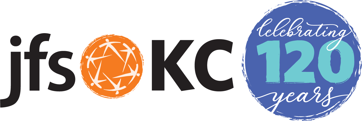
120th Anniversary Branding
In 2022, JFSKC celebrated their 120th anniversary. The number “120” is a significant one for the Jewish faith (a common blessing is “May you live until 120” so the organization wanted to created specific branding to use during the year of this important milestone and to utilize in the anniversary-specific commemorative events scheduled that year. Ultimately the best solution was a mark dubbed the “Celebration Circle” to add onto the end of their existing logo. This maintained their branding well, but also added a celebratory bookend to their brand. The Celebration Circle was used both in combination with their existing logo, as is pictured here, and separate, as its own standalone mark.
Takeaways
With constant changes in how logos are used, seen, and interacted with, it’s important to take a look at what is and what isn’t working when approaching a brand refresh. With this project, we took what worked – the mark, colors, and fonts – and removed what didn’t – the overly long typography. By condensing the typography to a simple and straightforward acronym, the logo became far more useful across a variety of applications. We then built on the color story and illustrative style of the mark to create an overarching visual identity that was consistent across the organization, internally and externally.